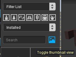
Disable 3D Thumbnails

Hello everyone,

The new version 122411 offers 3D thumbnails in the Surveyor. It's very small, with little contrast on a black background. For me it's totally unreadable.

On https://info.trainzsimulator.com/trainz-plus#3dthumbnails I read: Not all 2D thumbnails are made equally and for this reason we have added the option to switch to a 3D view of all your content so the preview is consistent when looking through content in the Assets Palette of S20.

If this is an option, how can I disable it? I haven't found anything about this option yet.

Best regards.
 
Hello everyone,

The new version 122411 offers 3D thumbnails in the Surveyor. It's very small, with little contrast on a black background. For me it's totally unreadable.


It seems that N3V are obsessed with using a dark theme. I've said many times before that elements of a UI should be configurable by the end user. Blender is a prime example of this. Shame that N3V don't listen.
 
The new version 122411 offers 3D thumbnails in the Surveyor. It's very small, with little contrast on a black background. For me it's totally unreadable.

I agree that the dark background makes some of them difficult (or even impossible) to see. There are some where the asset has almost the same colour as the background. When you select an asset its background immediately changes to blue (to indicate that it has been selected) so I would not think that providing a different colour background would be impossible.

However, on the plus side the thumbnails are now constructed directly from the 3D mesh of the asset and not from the, far too often generic and non-informative, thumbnail.jpg supplied by the asset creator. Plus they also show any animations that may be part of the asset.

If this is an option, how can I disable it? I haven't found anything about this option yet.

I did a search through the Settings and could not find any "off" switch. The "option" here, I suspect, is the choice between using the 3D view or the list view.

My thoughts.
 
If you double left click on any of the 3D thumbnails, the program opens the asset detail window with the asset's thumbnail image and the description text. This also works in text mode.
 
If you double left click on any of the 3D thumbnails, the program opens the asset detail window with the asset's thumbnail image and the description text. This also works in text mode.

Yes, as in the previous version, but it's like double-clicking several times at random before you find what you're looking for, whereas the 2D thumbnail did the trick just fine.


I think the best solution would be to create picklists of what you want to use, then select assets by name.
 
That is a good idea. You should suggest it.

By the way, if you use thumbnail view in CM, you can choose multiple assets using either ctrl+left click or shift+left click to choose assets and then right click on one of the selected assets and choose "List Assets in New Window and all the chosen assets will be shown in a new CM window. In that new window, you can choose an item and use ctrl+shift+r to open it in the CM Asset Preview window which has many more features than the Asset Preview window built-in to Surveyor 2.

Yes, I know, but it takes much longer! :D
 
It seems that N3V are obsessed with using a dark theme. I've said many times before that elements of a UI should be configurable by the end user. Blender is a prime example of this. Shame that N3V don't listen.

I can't totally agree with your first sentence. I keep getting what are probably error messages in an illegible light grey on grey. Something darker might be better!
 
Back
Top