it was built to run along the side of a road. more then 90% of the weight of the engine and wagons/carrages actually did rest on, was carried by the rail rather then the outriggers. there is/was a fairly complete article about the system on an indian railfan site. or an indian rail musium site. i don't know if its still there or not.
personally i see diminuative form factor as rescuing almost anything that runs on a guideway from complete ugliness, and the disseconomies of excessive scale, to which north american standard guage freight opperations are no exception, as being the main line of uggliness. yet even there, this is from time to time redeamed by sufficiently bizaar interestingness.
i do find paintjobs with humanlike features unattractive as well. appearently some members of the general public don't, or marketing guru's don't, or something. i DO like intese, cool colors, arrainged in intersting hard edge graphic ways.
thomas is ugly, that idea of putting a human face on everything that would have a perfectly good and attractive appearance otherwise is ugly on general principals. creative graphix are not, as long as the're about an intrinsic geometric aesthetic, and not trying to make something look like something its not.
 Claude
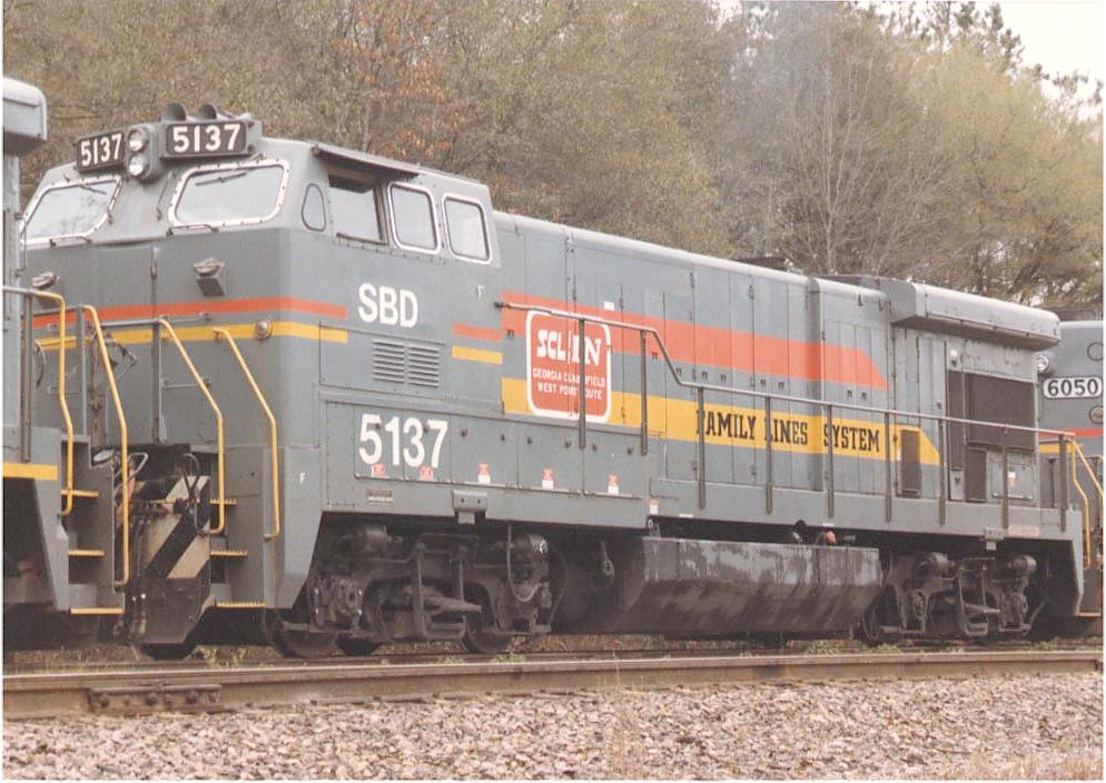
") Weird AND ugly! What a combination!!
Weird AND ugly! What a combination!!