TS19 Update What happened.

Sean_lee

Member
Last 2019 update, Some really silly things done.....
Why as the add Baseboards, been coloured in a horrid green and not the Grid.
And the most useful tool, the textures fill Grid button has gone/removed. Really was the most useful tool for infilling large areas.
Also my Trainz Plus 2019 in the update went to Platinum. Sort of the same I suppose.
The Baseboard colour and fill grid removal has just made editing that bit harder.
 
Filling the grid with grass is the "new" thing. The base texture can be replaced by editing the region config.txt file and there are some already up on the DLS.

The fill grid is now done using the Bulk Asset Update, Replace, Delete utility.
 
Filling the grid with grass is the "new" thing. The base texture can be replaced by editing the region config.txt file and there are some already up on the DLS.

The fill grid is now done using the Bulk Asset Update, Replace, Delete utility.
A simple thing just made that bit more complex. I used to lay down my fields and other textures like Ballast main line and yards, and everything else was fill grid. Bonkers update was that.
 
There is a replacement Australia Region asset on the DLS which has the "traditional" TRS19 grid pattern with all the other Aussie features (traffic, driving on the left, etc) untouched.

It is <KUID:45176:100490>

After installing just open the Edit Route command from the Edit menu in Surveyor and set the Region to "Australia with TRS19 Grid".

I have created similar assets for UK, USA, Germany, France and Switzerland.
Ok thanks will do that, until they realise the stuff up they have done and revert it.
 
N3V business model pretty much summed up there!

If that was true they would have gone out of business long ago. Can you name me an organisation that has a perfect "track record" for making consumer/customer decisions? In any case the problem was easily "fixed".

You could very successfully argue that a better option would have been to allow users to set the texture pattern to be used for the next new baseboard that is added, via a Surveyor menu option (or a palette/panel feature in S20) and this may come in a future release. This, somewhat clumsier attempt via the region asset, may be the starting point for a better option.

My (optimistic) thoughts.
 
Indeed! I very much agree with these true and succinct comments!

Rob.

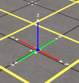
Me too! Another bug bear of mine is that horrid new compass. Have had to hide the thing as it is so large and cumbersome that it gets in the way when in surveyor. Sad thing is that some on this forum like it...wait for it..."because it looks nice".!!. Nothing about negative effect on functionality...It wouldn't be such a bad thing if we were offered the ability to use the previous incarnations of the grid and compass, but no, we are stuck with them.

N3V two steps forward, one step back....
 
Last edited:
I agree. I hate this new compass in TRS19 SP5, but I actually quite like the one in TRS22 beta, and I hope they add that one to a future TRS19 update.

[FONT=&quot]
mTvcuwv.png
[/FONT]
 
Last edited:
@dundun92...well that is certainly an improvement not only on the last iteration but also the original compass. Definitely wish to see its inclusion in a future TRS19 update.
 
I am going to go out here on a limb (as usual) and state that I preferred the previous (style over mundane function) compass.

Compas-S20-Old.png

It has a presence and an authority. You knew what it was and what it was there for.

I do not like the latest (mundane function over style) compass.

Compas-S20-New.png


This one has anorexia, no "confidence" in its purpose or abilities and looks like it is trying to hide.

Bring back style!

My opinions.


I prefer the 2nd one. Now that's a compass that knows its place. The first one is far too pretentious.
 
I would like to see a hybrid. Plainer, and different colors for directions, but with larger letters in a clear, plain font, so it is easier to see the actual directions from father off. Most f the time, I only use it to set the location of focus in surveyor or driver, but sometimes I really want to be able to see if I am facing north, south, east or west without zooming in as close as these screenshots.
 
Has anyone though of the bright idea of allowing people to select different kinds of compasses in settings?...
 
Back
Top