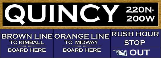
Now, color-coding used as the signs' background would indicate an A station (red), a B station (green), or an AB or All-Stop station (blue). The typeface would be Helvetica medium, found to be the most effective for CTA signs in the Dan Ryan and Kennedy experimental signage. Instead of the previous style of using only capital letters, upper and lower case letters were used to improve readability in addition to the use of the Helvetica font. This series of signs made another interesting change that has remained to this day: whereas the word "and" in a station name had previously been symbolized by an ampersand (such as at "North & Clybourn"), it would now be symbolized by a backslash (such as at "Clark/Lake" or "Adams/Wabash"). (The Dan Ryan signs were also peculiar in that they gave much more play to the long name "Wentworth" than to the numbered street that the station was actually named for, not to mention the fact that the stations were actually nearer to the Dan Ryan Expressway than Wentworth or State Streets.)
The basic forms remained: horizontally long rectangular signs bearing the station's name and address coordinates supplemented by smaller vertically-rectangular symbol signs, posted at the passengers' eye level, displaying the station name, station type and the destination of trains serving that particular platform.


")