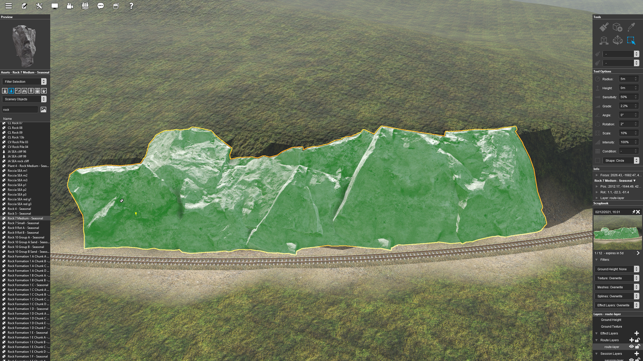
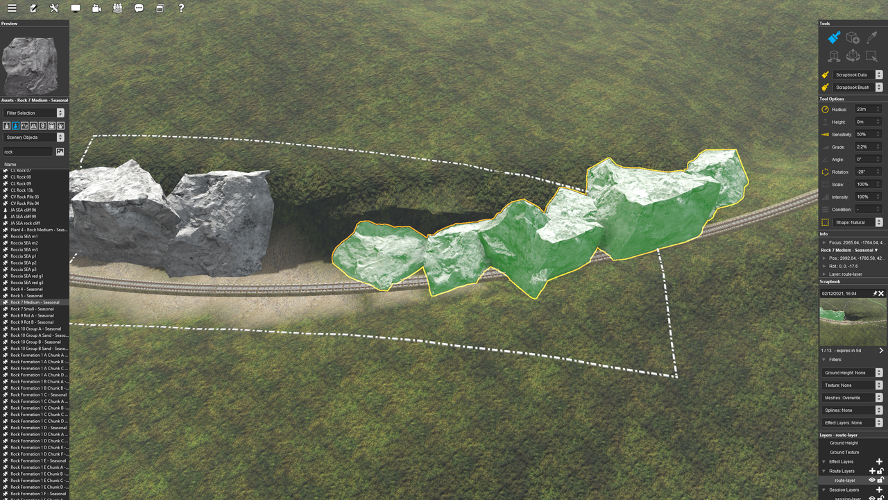
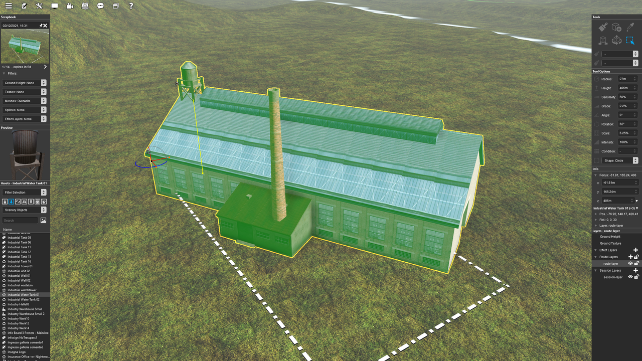
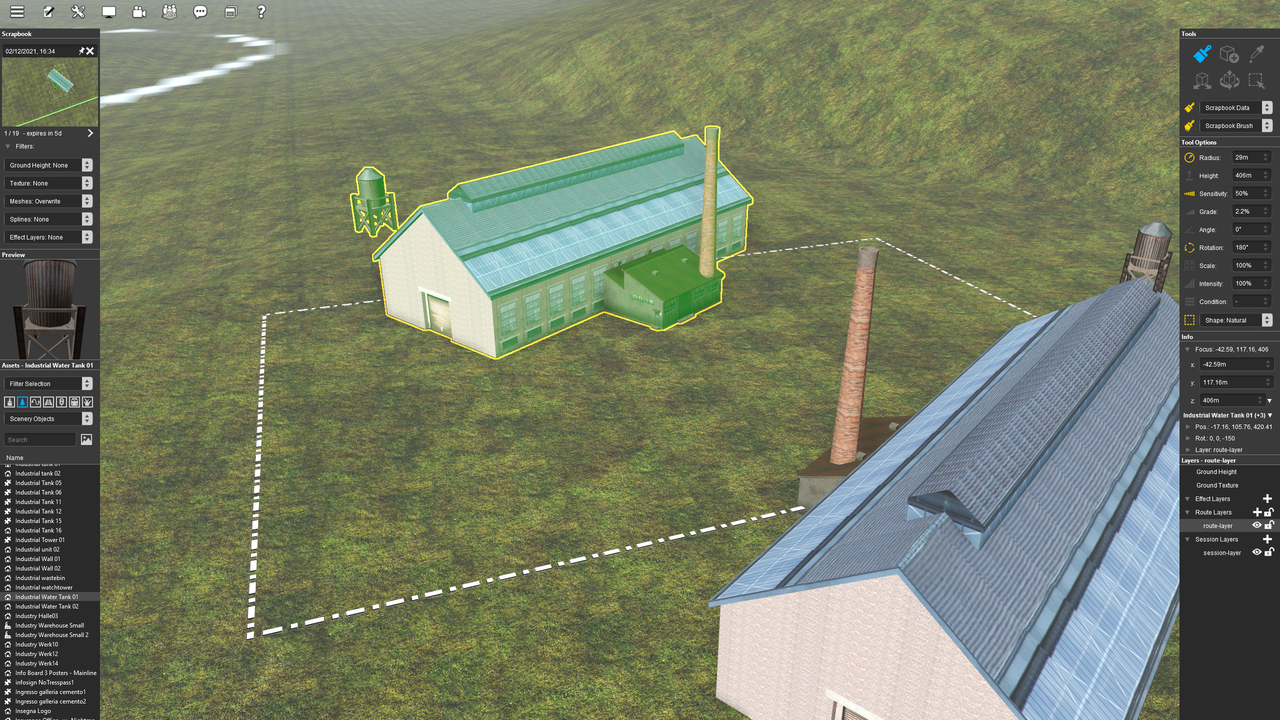
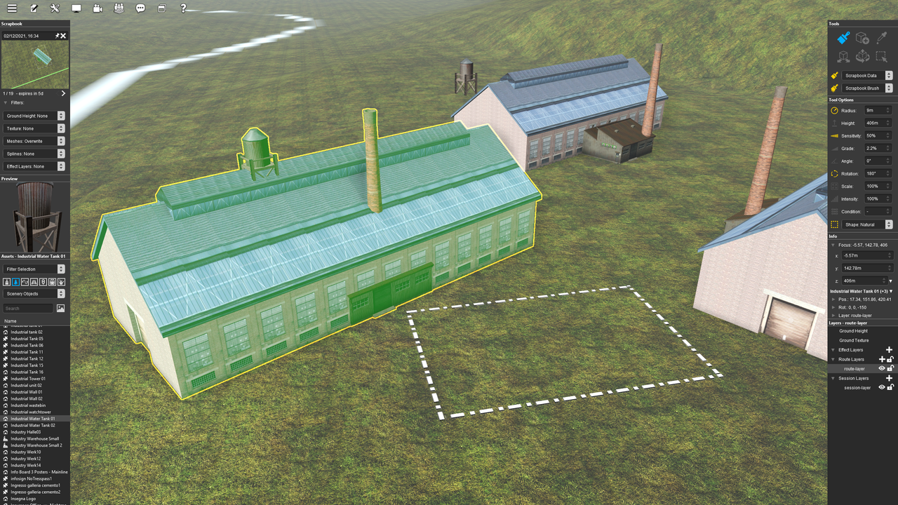
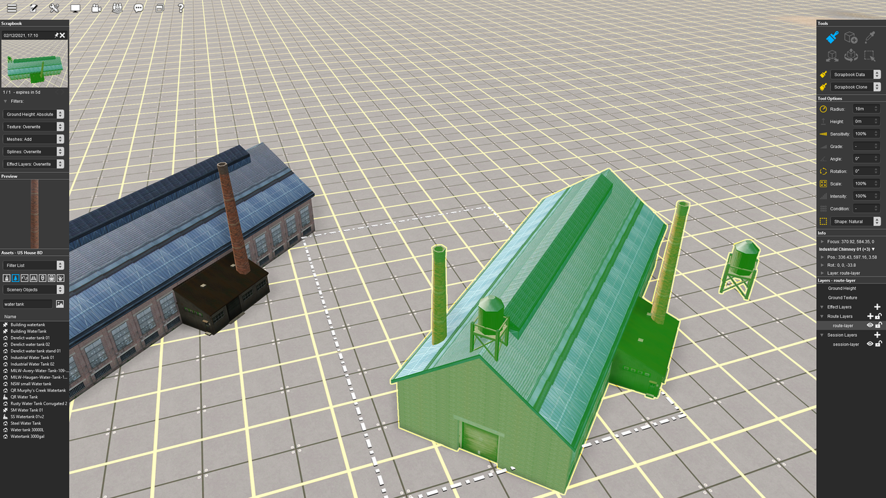
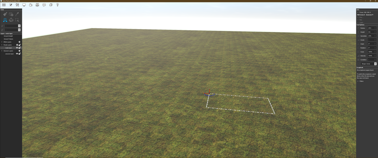
As I start working with Surveyor 2.0 the overriding impression is that it provides a massive leap in terms of usability. A real game changer, however I do have some observations regarding minor niggles so here is my feedback thread. This is not for bugs, but rather for feature optimisation suggestions.
* Un-docking and hiding palettes. Why would you? At the moment there is no benefit in doing this because the dock remains as a huge grey bar eating up real-estate at the edge of the screen. Please can we have the palettes "clipping" or "sticking" to the screen edge. No giant grey dock underneath please.
* Somewhat linked to my first observation, the dock is rather narrow, particularly for the assets palette. I can't read the full names on many of my assets. It would be nice not to be restricted. Again, just allow us to "clip" the various palettes to the screen border without enforcing a set width for them.
* Object placement tool. I love this change, but how about the option not only to left button hold and drag but also left button + shift hold (for example) to rotate around the Z-axis?
* Tooltips. If I'm viewing assets by thumbnail, can we have mouseover tooltips with the name? Especially useful for ground textures.
* I miss not being able to build custom filters right in Surveyor on a one off basis. Having that white content manager window pop out to edit filters kind of breaks the congruity of the interface a bit and it annoys me that I have to create and save the filter every time. I can filter by trains, or by today, but if I want to filter by trains AND today I have to create and save a specific filter instead of just doing it as a one off.
I'll keep adding to this thread if I have further suggestions.
Last edited:

