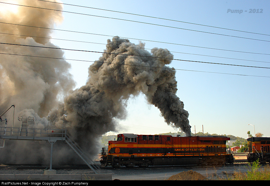
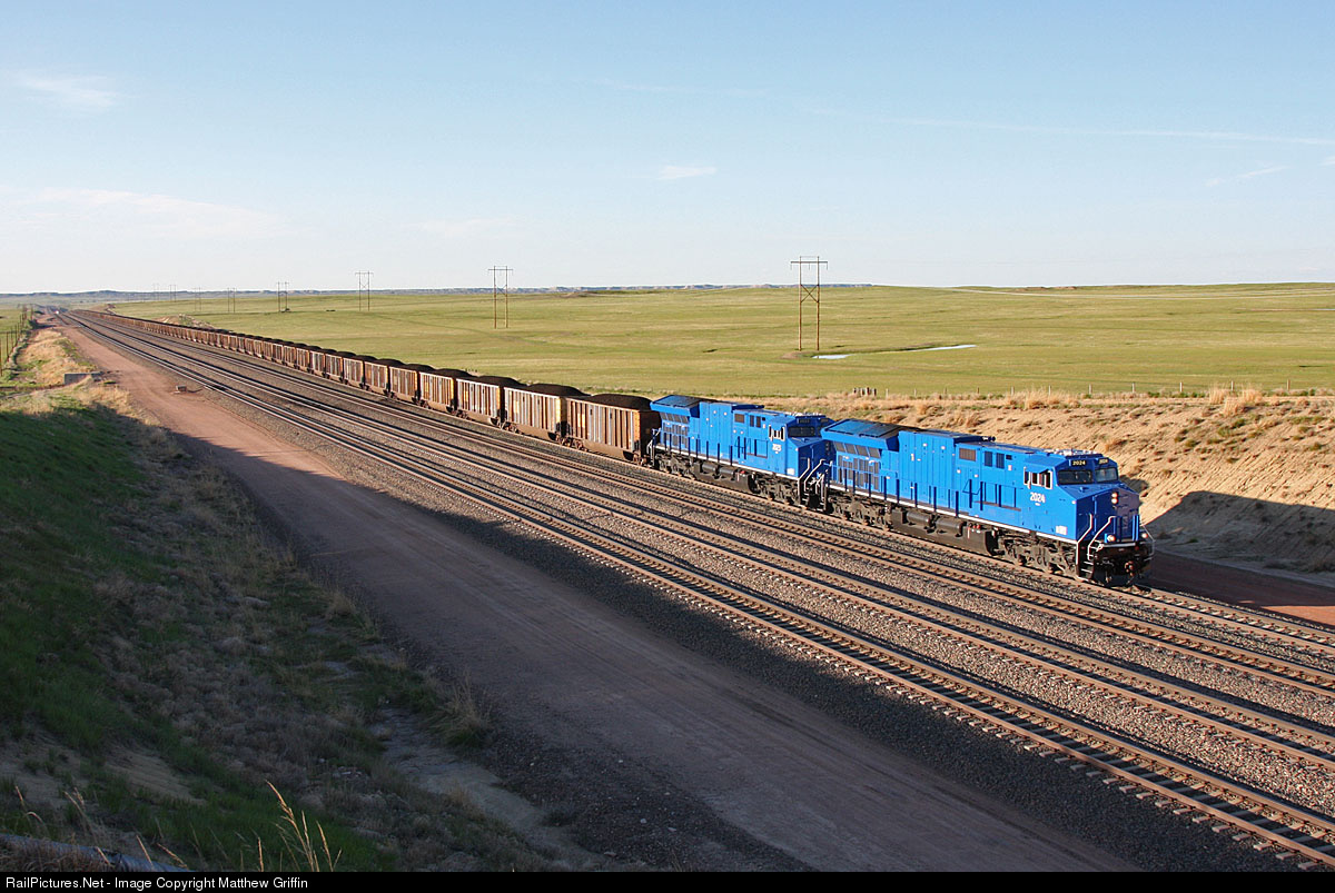
GECX ES44AC 2023

I thought I might as well post my photos of it on the KCS line that runs through here.

Body/Roster Shot.
bb8b420db9fc010c5b838e57c3d9421b.jpg


Cab Shot.
eacff8d25274c2e7976ca7a2ada2db83.jpg


Back End Shot
b24e627ac32d791b31a44a58074f02cd.jpg
 
Those cab numbers always make me think comic sans


Close. Comic Sans has some odd rounded edges that don't quite line up. This is New Gothic, from the Bitstream Family. It's close but not quite. I was initially looking for News Gothic, but that's not a free one available. http://www.myfonts.com/fonts/tilde/news-goth/. I worked for nearly 10 years in desktop publishing and as a typesetter and got to "know" my fonts pretty well. :D


New Lincoln Gothic BT Family 24 styles Web Foundry: Bitstream
Try it Add to: Wish List
Web Fonts


Save Change All Previews Reset


Show all 25 products from the New Lincoln Gothic BT family starting from
 
Those numbers aren't News Gothic... not sure right now what they are; but I know what they aren't. Look at the ends of the letter forms. News Gothic has square number ends, the GECX numbers are rounded. I'll do some digging to see if I can find out what they are.

peter
 
font is called "ge-inspira". went to the GE site and its right there in the open.

Interesting... Very close to News though, and very typical of corporate logos and fonts which are usually based on something else.

Never thought of going to GE's site for this!

John
 
I wonder how long it will be before we see these ugly beast running around everywhere! They have such an odd radiator design. It almost looks Australian to a point, or a hybrid of the AC6000CW radiator. It's impossible not to notice the differences between those and the current ES44AC's we have right now.
 
Interesting... Very close to News though, and very typical of corporate logos and fonts which are usually based on something else.

I'd have to disagree that it is anything like the link you posted above. It is more similar to a Technic font used in old manuals or the Leroy templates used in drafting and architecture which is where Comic Sans got some inspiration from, so I'd have to agree with Simulatortrain on that one. GE has used the technical style lettering on most things since the 70s (cab interior panels, locomotive manuals, brochures).
 
I'd have to disagree that it is anything like the link you posted above. It is more similar to a Technic font used in old manuals or the Leroy templates used in drafting and architecture which is where Comic Sans got some inspiration from, so I'd have to agree with Simulatortrain on that one. GE has used the technical style lettering on most things since the 70s (cab interior panels, locomotive manuals, brochures).

Actually, now that you mention it, Yes! I was also looking for Speed Ball, but couldn't find that one. That's one of the derivatives of Technic or the other way around, depending upon when it came out. Speed Ball is named after the old drafting pens of the same name. You need to be careful with Technic because Adobe has derivatives of that which have hinting that allow variations on it. The variations are very subtle and can be nothing more than a small adjustment of a point or two here and there which can fool us and drive people nuts when trying to match kerning and fonts exactly. The have a few of these fonts out there, but I can't remember which ones.

My brother uses an expensive program called Imagaro which will outline trace fonts and then check online for the actual font. There are tools to do a close match and from there it will name the actual font. It's pretty neat and very precise. Once the font is named, you can either export the outlines, or install the font if you have it. For him the program is used for his graphics business, and despite it's initial cost has paid for its self more than once. He creates, or rather recreates artwork most of the time for the screen printing and printing industry. You wouldn't believe how many things he gets in that were "designed" in PowerPoint or are scans of long-lost artwork that needs to be recreated.

John
 
I found a font called speedball but it still wasnt close. Maybe you meant another one. In any case, the locomotive lettering was identified.

Also, I noticed while cooking dinner that my stove, dishwasher,microwave, and refrigerator all use the GE-inspira font... Funny how I never noticed that until I searched for that font on the locomotive. Normally, those like myself looking to get as close as possible to prototype typefaces can not rely on computer fonts because none of them match. Only very few can be made by typing in a certain font, and most of those are usually more modern where the prototype actually used said font (for instance I was very surprised to be able to make the Indiana Railroad 25th anniv logo [seen here] using fonts I already had on my computer - that hardly ever happens). Most of the time I hand draw logos or lettering to match photographs because it is really the only way to get it right.
 
I have the same issues Justin. Being a graphic designer, I get pretty annoyed when I see people using the wrong fonts for things.

I've started a list of a bunch of Railroads and what fonts they use (and often an alternative to customs) probably useful to most doing textures.
http://s4.zetaboards.com/amtkz/topic/9444989

I would like to get my hands on the GE font, I was able to find one weight of it online for free (from a probably not-that-reputable font website) but a full(er) collection would be nice.

peter
 
You guys might be interested in this here:

http://imagaro.com/

I don't think you need the professional version. If anything, the program can also line-trace, fairly accurately, logos and artwork which might be useful as well.

I agree Peter. This has been the bane for many years, and in particular since the advent of all those TrueType fonts - the ones you can get 10,000 fonts for $10.00 on DVD. The problem is some nitwit will take Helvetica, and create an altered version of it, perhaps lower the X-height, and make it a bit fatter, then call it something else, all to avoid paying royalties back to the original creation house. Now there's a new font! Not! Then a designer uses it for something and wants a T-shirt done, however, most designers have no clue when it comes to production, and the artwork will need to be re-output or recreated to make it screen-ready. Herein lies the problem, the screen printer or prepress company now has to research the font, and because this isn't Helvetica, but is close, they end up substituting the wrong font, cause weird spacing issues.

Granted, a library of authentic fonts is expensive. Back when I worked in the industry, the complete 10,000 or 15,000 font library from Agfa cost something like $900 or more; the same from Adobe was much higher. Like everything else, this goes towards the royalties that are paid back to the type-houses such as ITC, Monotype (Agfa now), Merganthaler, and others. The thing is if the real deal is used, then it's easy to identify. In GE's case, however, this is normal. Many companies have variants on standard fonts and have design houses create the fonts for them. There is most likely a complete set of characters too to ensure that all their corporate books, equipment, and everything else has the same look.

John
 
Thanks John, that is a nice looking program at not a bad price. It would certainly save me hours of drawing railroad logos and fonts by hand in illustrator.
 
I'm skilled enough with the pen tool in Illustrator that it usually doesn't take me that long to trace logo, so that I have a vector version. There is also a website I always check first as they have a huge collection of vector logos from companies around the world (and in history); called: http://www.brandsoftheworld.com/

But when it comes down to it, I'm still often re-tooling a logo & having to read pages of links from Google to find the right font.

I have Adobe's Font Folio CD (ok it's like 3 CDs) which I got a while ago & don't remember the cost. It's a nice resource of fonts when I need them, but the file management system on the discs is horrible so I only install the font faces I want/need. (ie ever face is in it's own separate folder) It's actually gotten to the point that scrolling thru my font library takes long enough that I rarely pick fonts that way anymore.

peter

ps. oh Wikipedia is also a good place to get logos these days, a lot of the ones uploaded are svg files & hence are vector.
 
(sorry double post)
Thanks John, that is a nice looking program at not a bad price. It would certainly save me hours of drawing railroad logos and fonts by hand in illustrator.

I just had an idea, why not start a library of RR logos for content creators? At this point I'd be willing to put up most of the logos I've re-made.

peter
 
Back
Top