Worse Railroad Paint Schemes

Alex99al

CLOSED
Hey gang,
I know railroads make paint schemes to establish their own identity. But, sometimes they make schemes that either make you yuck or worse...faint in disbelief. I will start the thread....http://pc.railfan.net/pics/equip/pc2415.jpg, http://pc.railfan.net/pics/equip/pc2415.jpg, http://pc.railfan.net/pics/equip/pc2415.jpg, http://pc.railfan.net/pics/equip/pc2415.jpg, and http://pc.railfan.net/pics/equip/pc2415.jpg. Believe me, Penn Central had probably the worst railroad paint scheme in history, second only to the paint scheme of Southern Pacific Santa Fe...http://pc.railfan.net/pics/equip/pc2415.jpg. <----That is probably the worst railroad scheme in history. It beats Penn Central's horrible scheme any day...it makes Penn Central look good and Penn Central was horrid. Santa Fe was better but that scheme screams..."HORROR!!! THE HORROR!!!! THE UNADULTERATED HORROR!!!!!"
 
Just an FYI, all the pictures are the same. And I wouldn't say the Penn Central scheme was ugly...just too plain. And I for one was partial to the SPSF red & yellow scheme. But then again I haven't seen a scheme that I haven't liked.
 
696325918_e6adb90b88.jpg


7811.1207804321.jpg


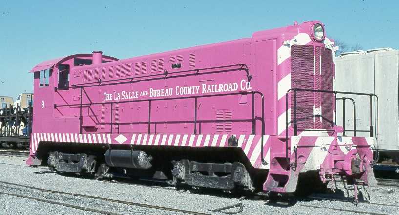
But by far the worse has to be that Hot Pink Baldwin.(I can't find pics though)
 
The PC and late PRR schemes were due to a lack of money needed for respectable paint schemes. Personally, I like them both, and whoever would say (almost) ANY paint scheme looks bad on an Alco, ESPECIALLY a Century, makes me question their judgement. :hehe:

But in regard to the topic of this thread, what are these (or this, since you posted the same link about 300 times) paint schemes worse than?

(Poor CF7, and no, I will not be doing a skin of that.)

Just for a FYI, no one will EVER take you seriously if you call a Santa Fe warbonnet "HORROR!!! THE HORROR!!!! THE UNADULTERATED HORROR!!!!!" and in fact you life could be in danger after saying that in certain places.
 
Last edited:
To say the truth, there are very few "worse" paint schemes that I can think of. That is to say that there haven't been a few questionable choices of color choices.

One that comes to mind is BNSF 9647, also known as the "Vomit Bonnet". http://www.railpictures.net/viewphoto.php?id=257695&nseq=2

It's not pretty, but it was experimental and we can let it slide.

As for what jadebullet was looking for:
lsbc9vo1000a.jpg


And here's the kicker: this engine is available to run in Trainz :p

- Jonathan
 
yeah,I agree klinger,

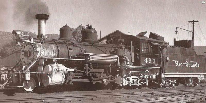
the silver colors was a nice addition to the D&RGW locos and other NG Railroads that ran in that area!;)
 
It looked good on 268 in Bumble Bee colors, it went very nicely with the Yellow with Black stripes. But Silver and Black.....No, that's terrible!

Silver trim, smokebox, thats all good, but the entire running gear, HELL NO
 
It looked good on 268 in Bumble Bee colors, it went very nicely with the Yellow with Black stripes. But Silver and Black.....No, that's terrible!

Silver trim, smokebox, thats all good, but the entire running gear, HELL NO

yeah,hey now what about the 4501 that looked good in green,gold,red and silver and they should have kept it that way,its too bad they changed her to wear black in her days of hauling freight, I just don't think the 4501 should be wearing black,not all steam locos were painted into that color,some were colorful instead of dull!:(
 
I heard that the Penn Central barf Green was a custom made exprimental conglomerated mixture of several discontinued "knock off" paints & primers. :p
 
The PC and late PRR schemes were due to a lack of money needed for respectable paint schemes. Personally, I like them both, and whoever would say (almost) ANY paint scheme looks bad on an Alco, ESPECIALLY a Century, makes me question their judgement. :hehe:

But in regard to the topic of this thread, what are these (or this, since you posted the same link about 300 times) paint schemes worse than?

(Poor CF7, and no, I will not be doing a skin of that.)

Just for a FYI, no one will EVER take you seriously if you call a Santa Fe warbonnet "HORROR!!! THE HORROR!!!! THE UNADULTERATED HORROR!!!!!" and in fact you life could be in danger after saying that in certain places.
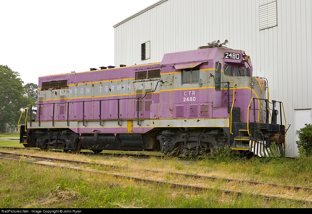
That's not the Warbonnet paint scheme, I'm talking about. I'm talking the Koachadrome scheme of SPSF. This is about ugly railroad paint schemes...I only started with Penn Central because, Penn Central had the worse scheme of them all. Southern Pacific Santa Fe's ranks as "horrid" of the year. The Santa Fe warbonnet scheme was one of the best, but definitely not the SPSF scheme. That was plain atrocious.
 
Last edited:
I heard that the Penn Central barf Green was a custom made exprimental conglomerated mixture of several discontinued "knock off" paints & primers. :p


;) now from what I was thinking,that is nasty for how it sounds,it definately is something that I would not use on a locomotive of any type!:eek:

;) now the only paint colors that I seen that were nice were the daylight of the sp on it's GS-4 locomotive and Southern's PS-4 class pacific engines,but as for diesels for horrrid of the year on the southern pacific and Penn central definately derserves that title!:hehe:
 
Last edited:
Alex- that's not what it sounds like.

I like that Family Lines scheme, but there's not much I don't like :hehe:

The BNSF vomitbonnet is one that I don't, though.
 
Alex- that's not what it sounds like.

I like that Family Lines scheme, but there's not much I don't like :hehe:

The BNSF vomitbonnet is one that I don't, though.
By vomitbonnet you must mean the green and orange thing they have going on? I'm not too fond of that either, but the BN green and black was really nice as long as it didn't have tiger stripes.
 
Heck, that'll make you wanna up chuck and pass out and wake up in 20 years.
(1,000 points to who guesses my reference. :hehe:)

;) I'd faint after looking at the paint,yes but I don't know about waking up in 20 years though, you usually don't see too many locos carrying colors that someone threw together!:hehe:
 
Back
Top