Preview Asset annoying change

ettore48

Member
Hello

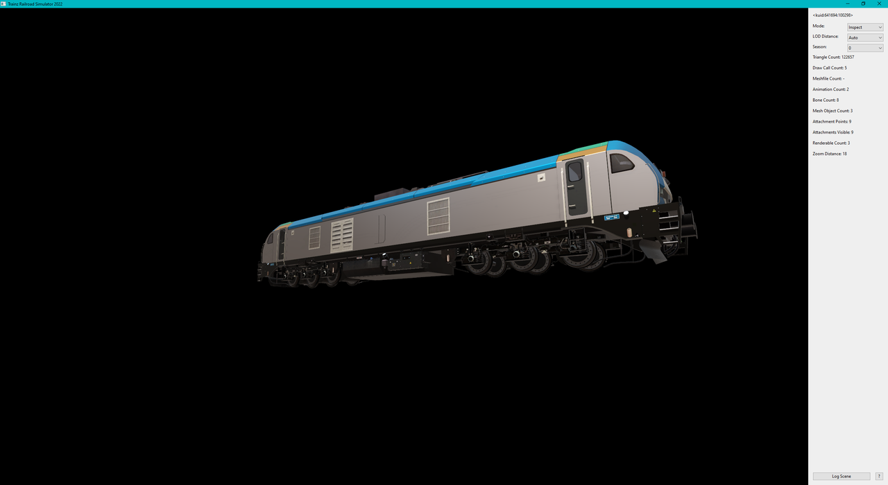
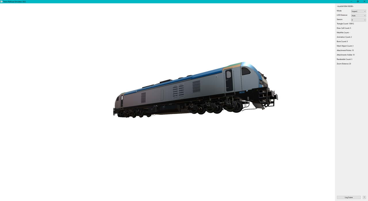
After the update to Build 126273 I noticed a (disturbing) change:

In the "Preview Asset," the ground color is now black instead of white. I can no longer properly understand the model's final colors.

Is there a way to change the base color back to white?

Thank you in advance for any help.

Ciao ALMorgan
 
I noticed that too recently. I prefer the white background as well and it would be nice if there was a choice.
 
In fact, I think it makes it easier (even from afar) to see normally dark details and that the very light background is too contrasting. An alternative could be for this to be adjustable by the User. Personally, I don't dislike it.
At same distances ...

sta.png


stab.png
 
Last edited:
Question: How can I submit this problem? I think they are the ones who can reply, but nobody is taking care of reading the forum messages.

Best ALMorgan
 
Try this. The devs don't have time to hang out in the forums and the QA Team will get back to you quickly.

 
The ability to change the background colour of preview asset (PA) to actually suit the needs of the user would be nice. I use PA a lot and while I wasn't very keen on the white background, I don't much like black either. Maybe its my tired eyes.

For some reason that escapes me, the majority of the Blender community seem to like dark backgrounds for their themes as do the Trainz Discord community. I posted a screenshot of Discord once with a white background and got assailed with complaints that I was blinding readers. Bowing to public pressure I changed to the obviously trendy dark background.

I'd be curious about N3V's response if they actually give any. ;)
 
I think most users have the brightness and contrast set way too high. Most monitors come that way out of the box. I use a hardware device to calibrate my monitors and adjust them to the ambient light in the room. The white point on my monitors is set to 224 out of 256 since I have the shades closed most of the time. When I was designing websites I never used pure white since clients always complained that it was too bright.
 
The ability to change the background colour of preview asset (PA) to actually suit the needs of the user would be nice. I use PA a lot and while I wasn't very keen on the white background, I don't much like black either. Maybe its my tired eyes.
For some reason that escapes me, the majority of the Blender community seem to like dark backgrounds for their themes as do the Trainz Discord community.
I agree that the best would be an intermediate tone. In both Gmax and Blender I have felt comfortable with a relatively dark tone (and a gradient) compared to the default light grey of the older versions. Not only does it make work easier, but it is not tiring - in my opinion.
I have tried almost white (awful), black, light blue with white lines, and shades of Grey (less than 50 😉) to see if there was any advantage but I did not see any, beyond it being a matter of taste.
 
Dark backgrounds are presently a strong trend. You can have dark backgrounds just like every software you use, and sometimes I appreciate them better than white backgrounds.
My complaint about the dark background is that you cannot recognize the shadows in the Preview Asset as you can with the white one. Everything goes black.
When I use the preview to create the thumbnails, the results are "poor," at least. I hope they can offer it as an option.

Best ALMorgan
 
Back
Top