More Font Hunting

Hello, all.

Does anyone know what fonts were used for the New York Central's steam locomotive running numbers and for the Boston & Albany's tender lettering and numbering? Just wondering.

Regards,
 
Sorry, you misunderstood the B&A text. Here's what i'm looking for:

ba578_cw.jpg


What might this font be?
 
It's the same font.

That's called Engraver's Roman by MonoType. It's been around for about 130 years.

There are many fonts that are similar.

Go to dafont.com.

Put in your text, scale up or down, copy and paste. Here's Bank Gothic, which I think is a bit closer.

3145dfcf95416388cd43dc26c48845.gif

Here's Engraver's Roman (It's not the same...)

3bc6b87e70507324ddfbb400889696.gif

There's a possibility they used their own combination of things. What gives that away is the different amber sign (&) symbol is different that either for the specified fonts.

John
 
in my experience finding the correct font is nearly impossible. i usually end up just recreating the lettering by hand.

My brother does this all the time using Imagaro. It contains a database online that it searches and will auto trace the artwork to produce outlines. He'll then clean up the outlines in Illustrator and DrawPlus. Imagaro not inexpensive, something like $760 a few years a go for the pro version. He uses it to recreate logos and artwork from screen printed-only one of a kinds.


Is there anywhere i can get the Engraver's Roman by Monotype for free?

Probably not.

John
 
Friends, some typographic trivia. When the B&A and NYC were running steam engines, what we call a "font" today in computer terms, was then called a "typeface", and the word "font" was a name for a quantity of type of the same design that would fit the needs of a typesetter to produce documents. So a font would contain a certain quantity of each of the various letters, numbers, punctuation marks, &c. to enable a typesetter to prepare a typical document. But "typefaces" were used in printing, and while the lettering and numbers on a locomotive or locomotive tenders on a particular railroad might be painted to appear similar to the lettering on the letterhead and public documents (e.g., passenger timetables) of that railroad, the lettering was not a typeface, because it was not printed on, but painted on (usually, though maybe not always, using a stencil) the locomotive or tender.

The best bet, in identifying and reproducing the typeface of the lettering for a particular railroad in a particular era is to locate the archives of that railroad, using your favorite search engine, and contact archivists caring for that archive to ask what ephemera they might have in their collection, and determine what might be useful to use for typeface identification. Of course, there may be in the collection a document which lays out the design specifications, and actually gives the name of the font you need. In some cases, these archives may be located in a college or university which was on or near the railroad, or from the ranks of whose alumni the railroad drew a number of management people. Thus, in the case of the pre-NYC B&A, Harvard University (among others) holds some of the surviving archival material. In the absence of an archive in a University library, the next step is to look for a historical society for that railroad. The archives or the Historical Society might be able to provide you with a copy of ephemera (paper goods--public timetables, correspondence on letterhead, &c) dated to the period from which you can create the characters you need.

As far as getting a copy of fonts, one resource not often thought of is the fonts supplied with word processing software. Check your CD for your word processing software, and you will likely find that it contains a significant number of computer fonts that are not installed on your system, and within these fonts may be included the font you seek, in the case of the original poster, the Monotype Engraver font, which was licensed for your use by the provider of the word processing program. In my case, one of the CD's for my word processing software includes the Engraver MT font. And if you don't have your disks anymore, a search for a copy of the OEM version of Wordperfect X3; I found a new copy on line for US$13.95. Finally, there are websites that provide free fonts, which might offer the font you are looking for, and if not, something very close to it.


ns
 
Last edited:
Friends, some typographic trivia. When the B&A and NYC were running steam engines, what we call a "font" today in computer terms, was then called a "typeface", and the word "font" was a name for a quantity of type of the same design that would fit the needs of a typesetter to produce documents. So a font would contain a certain quantity of each of the various letters, numbers, punctuation marks, &c. to enable a typesetter to prepare a typical document. But "typefaces" were used in printing, and while the lettering and numbers on a locomotive or locomotive tenders on a particular railroad might be painted to appear similar to the lettering on the letterhead and public documents (e.g., passenger timetables) of that railroad, the lettering was not a typeface, because it was not printed on, but painted on (usually, though maybe not always, using a stencil) the locomotive or tender.

The best bet, in identifying and reproducing the typeface of the lettering for a particular railroad in a particular era is to locate the archives of that railroad, using your favorite search engine, and contact archivists caring for that archive to ask what ephemera they might have in their collection, and determine what might be useful to use for typeface identification. Of course, there may be in the collection a document which lays out the design specifications, and actually gives the name of the font you need. In some cases, these archives may be located in a college or university which was on or near the railroad, or from the ranks of whose alumni the railroad drew a number of management people. Thus, in the case of the pre-NYC B&A, Harvard University (among others) holds some of the surviving archival material. In the absence of an archive in a University library, the next step is to look for a historical society for that railroad. The archives or the Historical Society might be able to provide you with a copy of ephemera (paper goods--public timetables, correspondence on letterhead, &c) dated to the period from which you can create the characters you need.

As far as getting a copy of fonts, one resource not often thought of is the fonts supplied with word processing software. Check your CD for your word processing software, and you will likely find that it contains a significant number of computer fonts that are not installed on your system, and within these fonts may be included the font you seek, in the case of the original poster, the Monotype Engraver font, which was licensed for your use by the provider of the word processing program. In my case, one of the CD's for my word processing software includes the Engraver MT font. And if you don't have your disks anymore, a search for a copy of the OEM version of Wordperfect X3; I found a new copy on line for US$13.95. Finally, there are websites that provide free fonts, which might offer the font you are looking for, and if not, something very close to it.


ns

Very good explanation, and something I was going to add today to this thread. As someone who worked as a typesetter and in the printing industry for over a decade, I dealt with many typefaces which I am still able to identify. Surely the computer industry and digital world has changed the ease which we have access to the typefaces, but certain ones such as Engraver's Roman, though they've been around for 150 years, are not in the public domain and I don't recall seeing them among the free typefaces.

What has happened, however, is there are knock-offs. These are cheaply designed "fonts" that come on DVDs by the 1,000s. You can get these at places such as Staples or BestBuy with a bunch of clip-art packages for all of $29.99. These are great-looking typefaces, are similar to the real ones, but vary slightly to avoid the copyrights. The names might be, as made up by me here, Olde-Tyme Certificate, with their subsequent bold, italic, etc., or Swiss perhaps for Helvetica, but the publisher/creator will change a letter or number slightly, or perhaps the spacing and width hinting just a tiny bit.

Regarding this particular font. There's another one to look at. It maybe Franklin Gothic which is similar to Engraver's. Again this may not be available in the freeware, and surely the railroads created stencils out of cardboard and used that to paint the letters on, or they were hand painted. This makes a big difference in how they appear as they are not quite the same as you've mentioned here. In many cases, if the letters were individual outlines, the paint shop would have the names on a single sheet and an the & symbol separate. They may use a stock &-symbol as that was part of their set. This is still an issue with hand-lettered signs today. With the advent of vinyl lettering, big sign plotters, and lettering systems, the real typefaces and logos no longer need to be hand painted. This makes the decoration easier for the paint and lettering shops as they can apply single sheets rather than hand-letter and paint each and every word.

John
 
Is there anywhere i can get the Engraver's Roman by Monotype for free?

fontsgeek claims to offer it for free

edit: and upon looking at it, I'm not sure the claim it's engravers roman MT is right, engravers roman MT is a serif font, but the picture you posted of the tender text is sans-serif
 
Last edited:
It appers to me from the image illustrating an earlier post in the thread that "Engravers MT" may NOT be the typeface you are looking for. Fonts are grouped in families, and a family will have a variety of styles of the font. In the case of Engravers MT, these include two styles, "Engravers MT", and "Engravers MT Bold".

The appearance of the letters on the tender are close to the appearance of the Engravers family, and the illustrations provided by the original poster, and what I saw when I did an image search on the B&A seem to show that the lettering on the side of the locomotive tender appears similar to be "Engravers MT Bold". "Engravers MT Bold" is in the same family as "Engravers MT" but is technically a different typeface, unlike the algorithm based "bold" that one finds in a font manager on your computer. The computer, uses a digital manipulation that allows one to make any font "bold" (or italic, or bold italic) by clicking a button. This is a often a close match, sometimes very close, but a very close examination (by which I mean you're measuring widths of parts of the character with a micrometer) will show that, while the generated "bold" looks similar, applying a "bold" modifier to "Engravers MT" is not exactly the same as using the native "Engraver MT Bold" typeface.

Slight amendment to John's post: Railroad stencils were not out of cardboard. These stencils were used hundreds, if not thousands, of times, and cardboard just would not have been durable enough to use. The ones I saw on the Rock Island were either canvas, or thin steel on durable steel frames, sometimes designed to be placed over a rib on the car side and likely weighed 200 pounds each, with one stencil containing a single character. The individual stencils had a registering mechanisms, which when used correctly insured proper spacing and alignment on the piece of equipment being lettered.

I'm not sure if it's still on the Union Tank Car website (www.utlx.com) or not, but there used to be a video showing the steps in producing a tank car. One of the steps was applying the lettering to the car, and the video showed that this is not longer done with paint and stencils, but that the lettering on equipment now is almost all applied with adhesive backed transfers, just like modelers have been doing for years. I can vouch that these are often applied by hand, too, as I have seen the occasional piece of equipment where the person or persons who applied the transfer did not get the alignment or spacing just right. It's usually not obvious, and usually only is noticed upon very close examination, but a letter might be a half or a degree off plumb, or a fraction of an inch too far one way or another. Or, sometimes, they ran out of the correct numeral, and applied one that was close, but not exact..
 
Last edited:
It appers to me from the image illustrating an earlier post in the thread that "Engravers MT" may NOT be the typeface you are looking for. Fonts are grouped in families, and a family will have a variety of styles of the font. In the case of Engravers MT, these include

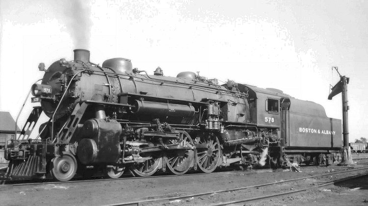
The font is definitely in the Engravers family, and "Engravers Roman" are different typefaces. Also note that the illustrations provided by the original poster, and that I say when I did an image search on line seem to show that the lettering on the side of the locomotive tender appears to be "Engravers MT Bold", which although in the same family is a different typeface, and it is different than using the algorithm based "bold" that one finds in a font manager on your computer. In the computer, the you can make any font "bold" (or italic, or bold italic) by clicking a button, and this is a often a close match. But a very close examination (by which I mean you're measuring widths of parts of the character with a micrometer) will show that, while the generated "bold" looks similar, sometime very close, applying a "bold" modifier to Engravers MT is not exactly the same as using the native Engraver MT Bold.

Slight amendment to John's post: Railroad stencils were not out of cardboard. These stencils were used hundreds, if not thousands, of times, and cardboard just would not have been durable enough to use. The ones I saw on the Rock Island were thin steel on durable steel frames, sometimes designed to be placed over a rib on the car side and likely weighed 200 pounds each, with one stencil containing a single character. The individual stencils had a registering mechanisms, which when used correctly insured proper spacing and alignment on the piece of equipment being lettered.

I'm not sure if it's still on the Union Tank Car website (www.utlx.com) or not, but there used to be a video showing the steps in producing a tank car. One of the steps was applying the lettering to the car, and the video showed that this is not longer done with paint and stencils, but that the lettering on equipment now is almost all applied with adhesive backed transfers, just like modelers have been doing for years. I can vouch that these are often applied by hand, too, as I have seen the occasional piece of equipment where the person or persons who applied the transfer did not get the alignment or spacing just right. It's usually not obvious, and usually only is noticed upon very close examination, but a letter might be a half or a degree off plumb, or a fraction of an inch too far one way or another. Or, sometimes, they ran out of the correct numeral, and applied one that was close, but not exact..

Thank you for the correction on the material. With the paint splatter on the surface it was kind of difficult to tell if that was cardboard or metal!

It's definitely in the Engraver's family. MT is Monotype and the typeface is definitely unavailable for free.

I saw these decals being applied once, but I never took pictures of it - never thought to now that I think of it. The decals I believe are vinyl and are cut and trimmed out on special sign cutters. These were originally made by Gerber Scientific from regular pen-plotters from what I was told. The engineers replaced the pen with a swivel knife assembly and made a lot of money at it in the process.

Having big plotters means multiple colors and complex paint schemes can be applied without needing to worry too much about the cost of repainting like in the old days when the painting and stenciling was all done by hand.


John
 
fontsgeek claims to offer it for free

edit: and upon looking at it, I'm not sure the claim it's engravers roman MT is right, engravers roman MT is a serif font, but the picture you posted of the tender text is sans-serif

Well, at least i know it's a Sans-Serif font...

Get over here, Google...

EDIT: I've made a discovery. The B&A's numbering uses the "Engravers Gothic Bold" font type. However, it's stupid how a font i'm probably only going to use once in my life is 30-some dollars. This is ridiculous. There is no way i am paying 30 DOLLARS for a FONT. It's stupid, and i'm not doing it.
 
Last edited:
My brother has the font and has recreated the artwork.

Now, this isn't a free job, but not expensive. He's doing this as donation-ware. Meaning, a donation via Paypal (I will provide my PayPal account) to the Kenny and John Beer and Game fund. :)

PM me if you're interested.

John
 
Back
Top