Things are bound to change. Probably paid some outfit tens of thousands of dollars for the new design. looks pretty good to me though, thanks for posting it Dave!
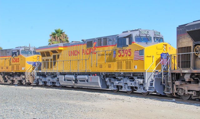
I agree the text should be lowered. All their artwork hugs the top of the locomotive which makes them look odd. Honestly, I think they used a Paintshed template!
")