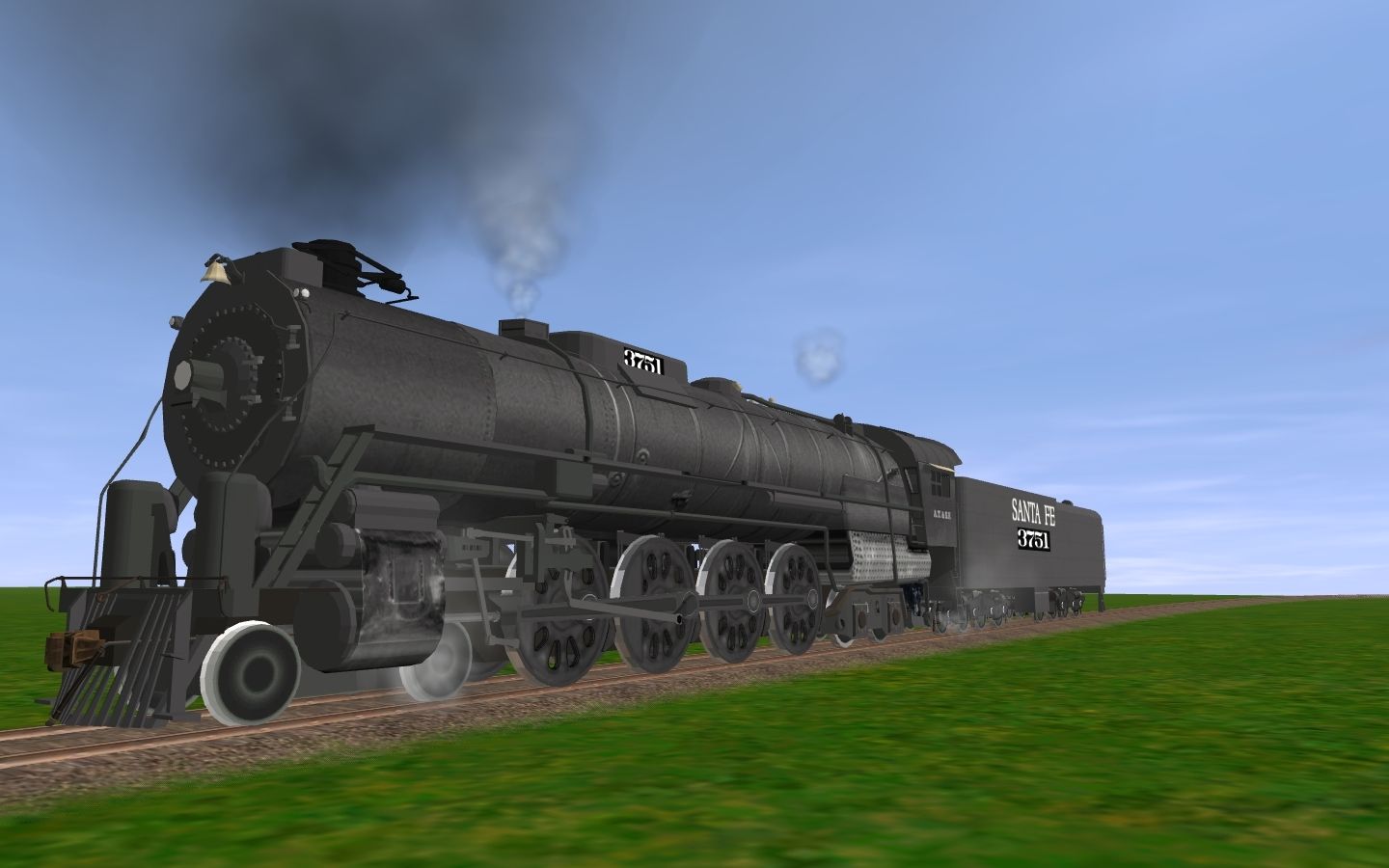
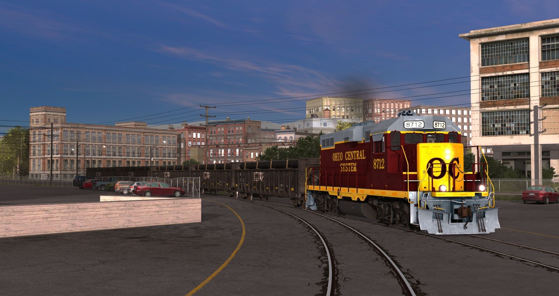
Show off your reskins!

That looks pretty good Nickelplateroad! The lower stripe may want to come up to just below about the middle of the numbers, but otherwise they look perfectly placed!
EDIT: Actually, I see there are model variations on where that lower stripe ends, so congrats on a great job!
 
Last edited:
That looks pretty good Nickelplateroad! The lower stripe may want to come up to just below about the middle of the numbers, but otherwise they look perfectly placed!
EDIT: Actually, I see there are model variations on where that lower stripe ends, so congrats on a great job!


Better?

Great job NKP!


Thank you


NKP


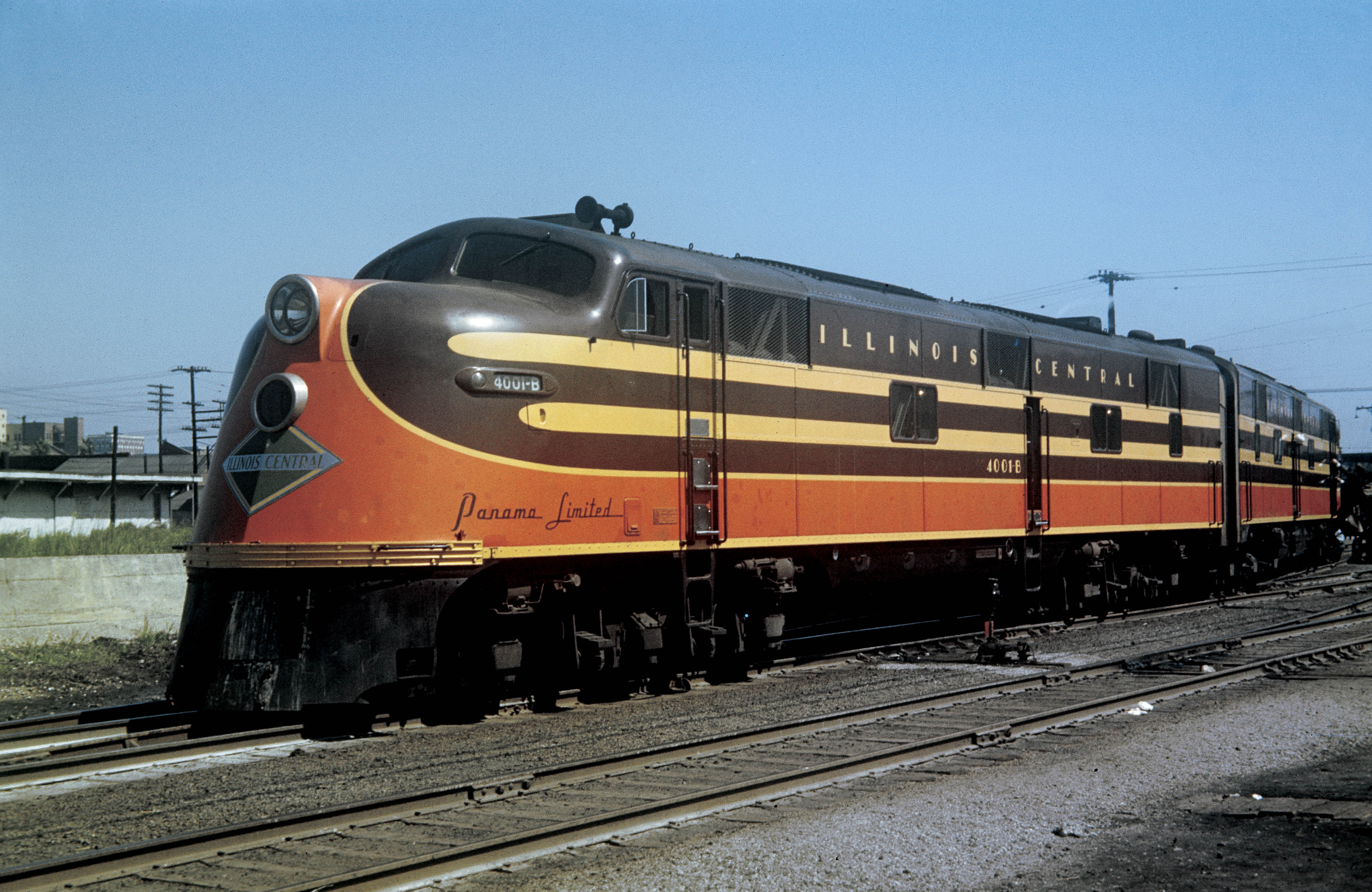
Wonderful. Just like the prototype photos I see out there. Outstanding job sir!

Thanks. I still looking for fonts for "Panama Limited" letters see pic here

0654.IC-Panama-Ltd-E6.jpg
 
There is likely not to be any typeface like that. That kind of lettering was often designed as a one-off in house.

peter
 
Nickelplateroad, I am wondering if you could copy the lettering from the sharpest photo you could find. The one you posted is not bad. Not razor sharp, but anyone posting a screenshot that large might be able to expect a similar resolution. Maybe a one-shot "Sharpen" in something like IrfanView, but not much more. Bending it to the curvature might be a challenge.
 
Nickelplateroad, I am wondering if you could copy the lettering from the sharpest photo you could find. The one you posted is not bad. Not razor sharp, but anyone posting a screenshot that large might be able to expect a similar resolution. Maybe a one-shot "Sharpen" in something like IrfanView, but not much more. Bending it to the curvature might be a challenge.


You can find a sharp image of it. Then paste it on a separate layer in your image editing software (gimp, photoshop, etc) Then trace the letters with a paintbrush and you will have a custom font.
 
It may be varied lighting or exposure. Yours looks a dead ringer for the photo you posted, others look darker. You could make variants maybe, as it would have to match any B units or coaches. Outstanding job NKP!
 
CB&Q SD45 in the Pre-Merger scheme. Nose stripes are not accurate but the white hood stripe is pretty good and I think the nose stripes fit the model well. Enjoy!

2022-01-24-185918.jpg
 
Nickelplateroad, variants would just be additional cloned copies with that orange/vermillion color tweaked a little bit for each one. You could probably make a skins kit, but probably easier just to clone a copy and then tweak the color.
 
Back
Top