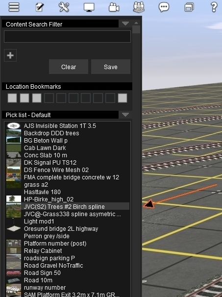
I thought I had read in a Tony message that this latest update was to improve "contrast in scrollbars". I have seen no improvement and the black on black remains the N3V standard.
Viewing the black/black menu scrolls, and selection indicators, is becoming more difficult. But N3V is stubborn (read Tony).
Viewing the black/black menu scrolls, and selection indicators, is becoming more difficult. But N3V is stubborn (read Tony).