brightness of 2019

nimec

Member
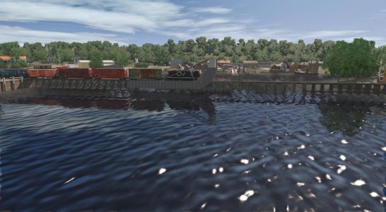
I have just installed TRS 2019 but find the picture a bit too bright and with a 'washed out' effect but I have not been able to find a way of dimming the brightness 'in game'. Is there a setting for this?
Have just purchased a 32 inch monitor and wound the brightness down to an acceptable level for normal MS Office, Internet use etc but the in game brightness is still a bit too high. Is there any way of bringing it down without altering the monitor controls. Cheers
 
There is an error on the Sun Colour Adjustment page.

3. Adjust the Blue and Green dials fully to the right.

Should say

3. Adjust the Blue and Green dials fully to the left.

William
 
Has been noted before though that N3V need to sort out the default brightness issues. Is it really acceptable that new players or owners of this version have to dive straight into a wiki to make sense of post processing options, of which the advanced ones cannot be saved anyway?
 
Advanced environmental settings can’t be saved? Again?? In TS19? Thats ridiculous and good to know.
 
nimec - You'll be delighted to see that the new TRS19 environment controls sports a brightness slider in addition to the existing RGB dials.
Find I get the best - and most realistic results - by toning down the direct sunlight levels (set to a uniform dark grey works well) whilst having relatively brighter ambient lighting.
This avoids harsh shadows and is infinitely variable for different diurnal time-slots.

env.png
 
Advanced environmental settings can’t be saved? Again?? In TS19? Thats ridiculous and good to know.

All environmental settings can certainly be saved (per session).

Post processing effects cannot (but they are nothing to do with brightness mentioned by the OP).
 
I think that what a lot of people are calling excessive brightness is really highlight clipping.
I've mapped a photographic test map to a box, and in 2019 a good quarter of the brightness range is maxed out white.
So far I've only managed to recover a good greyscale by using post processing. I'm still experimenting, so if aybody can tell me a setup that works by just using just the environmental settings I'll give it a try.

Chris.

Hi Chris,

Reset the environmental settings to default and start from there. I was able to achieve a lighting setup similar to T:ANE.

attachment.php
 

Attachments

  • 2019-01-26 184056.jpg
    2019-01-26 184056.jpg
    96 KB · Views: 179
It is my understanding that the default setting is not the issue. Resetting the settings using the reset button in the panel fixes the brightness problem of routes and sessions that were not created in TRS2019 in the first place. That is the only place that I see the issue and it is a quick fix. The only fix that N3V could do is to overwrite the environmental settings of any imported route. Is that really a better solution? By following the tutorial linked above, I was able to create several beautiful lighting setups in minutes.

I've not been bashful at expressing my desire to see gameplay improvements over making the sim prettier but I and others get out voted by the "we need photo realism" crowd. Well, you got it and it comes with the price of adjusting the world lighting on imported routes. Meanwhile the waybill system is still broke 15 years later.

William
 
Here are three shots that might illustrate my take on this:

First with the default settings
http://images.n3vgames.com/trainzportal/mytrainz/149445/screenshots/141780/800/default.jpg

Second with environment settings adjusted
https://www.trainzportal.com/mytrainz/view_media_post?media_post_id=141781

Third with environment and developer settings adjusted
https://www.trainzportal.com/mytrainz/view_media_post?media_post_id=141782

The first shot is way off on the grey step wedge. Second is a lot better, but I think the third is best as there is more of the texture showing in the highlights.

PS hope I posted the images ok,
Chris.

You nailed it with the third shot. That brings out the whole grey-scale, while the first two tend to mush them all together.
 
One factor that tends to be overlooked is the differences between different makes and models of display monitors. I have two different monitors attached to my main computer and the same scene is noticeably different (colours, contrast and brightness) between the two. The same scene on a laptop looks different again.
 
Another factor that is overlooked is that there is no real calibration of colors on the textures of assets that have been made. Everything is relative to one another instead of the sun and skylight and when the latter two are adjusted everything suddenly looks off.

PBR should allow the asset to look true-to-life in any light conditions, but sometimes ground textures are made too bright and they look alright in darker ambient light, but when the sun is shining bright, these textures take on a neon appearance.

IMO there has to be an easier way to "calibrate" textures so that what is taken on the camera, what appears in Substance painter/blender, and what appears in game are all adjusted for.
 
I recall time ago having this discussion on light and colors, maybe in 09 times. I suggested that someone should make a simple test chart or color bar asset. Place it at mid day and adjust colors (hue), saturation (brightness) and contrast (using a gray scale). You can do that now on your monitor downloading charts from YouTube. A sophistication of this would be to have a vectorscope, but that maybe too much. I am surprised that N3V has not made some user setting references, in view that defaults are not accurate. If we had a basic standard set, asset creators could use it as reference for their textures.
 
I recall time ago having this discussion on light and colors, maybe in 09 times. I suggested that someone should make a simple test chart or color bar asset. Place it at mid day and adjust colors (hue), saturation (brightness) and contrast (using a gray scale). You can do that now on your monitor downloading charts from YouTube. A sophistication of this would be to have a vectorscope, but that maybe too much. I am surprised that N3V has not made some user setting references, in view that defaults are not accurate. If we had a basic standard set, asset creators could use it as reference for their textures.

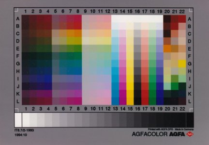
I've used this in the past to calibrate my monitor. This was for graphic arts, but I no longer use that. Maybe it can be placed on a wall asset and used for lighting adjustment.


attachment.php
 

Attachments

  • IT8.jpg
    IT8.jpg
    84.8 KB · Views: 79
The most useful part of that test chart is the gray scale. For colors you open a can of worms, but is doable.
 
I've used this in the past to calibrate my monitor. This was for graphic arts, but I no longer use that. Maybe it can be placed on a wall asset and used for lighting adjustment.

An interesting observation I have just made about that chart on my main display monitor. Scrolling the chart up and down the screen so that rows A B C move from the bottom to the top of the screen and back again produces a significant difference in the brightness levels of the colours, particularly in columns 13 to 19.
 
Brightness and colour change with viewing angles, unless it's an IPS screen.

It's easy enough to reskin any existing model with a calibration chart, but if anyone wants a copy of mine send me a pm.

Chris.
 
Back
Top