To TRS19 developers

I agree with that 110%. Some of the "Drivers" (Being very,very,very sarcastic with the "drivers" part.) look like they just came fresh out of the grave yard...:hehe:
But N3V just had to turn the good old drivers (Such as Willie the gimp,one of the only drivers that would fit altodave's ATSF and UP 0-6-0's,which philskene updated the UP 0-6-0.) into the demonic zombies that N3V thought would make "GREAT" drivers! (No,just no.).

So now there is no drivers that fit the UP and ATSF 0-6-0's in TRS2019 now...:( I just wish N3V would scrap those demonic zombie "Drivers" and put back the old ones... or even at least give people an option to go back to the old ones.

But for now,Rest In Peace,Willie the gimp...

(On a side note,since so many people are complaining and hate the zombie drivers that were born and raised by the devil himself,lets put them back in the grave yard,where they belong.:hehe:)


There are several things that could be done:

1) Forget the whole ill-conceived idea
2) turn the characters sideways so they are not looking at you
3) if you must have them facing forward, then have them wear sunglasses
4) also give then a healthy complexion
 
shaneturner12 was right when he mentioned 'Set Helper Icon Size' - <kuid:-25:791> - it is a built-in in TRS2019 (and T:ANE) and allows you to set the size of the arrows over junctions as a % of their default size.
A side-benefit of this is that the green bar overlays showing loading status over wagons during loading and unloading operations - and the commodity levels available at interactive industries - are also reset to your preferred, smaller size.
To use this Rule, simply add it to your session in Session Edit mode - Go to 'Edit Session Rules' (Add the Rule and Edit it to show, say 50%) and then click the tick to save, then save your session on exit.
 
Last edited:
Rescale the images of the arrows to something smaller?

To eliminate them, make them invisible with 100% transparency. They're still there but only in placeholder fashion and not visible to the user.

Reason I said this was because the icons themselves were quite small already, the textures themselves didn't have a relation to the scale in-game. That's where the other asset PC_Ace mentioned.
 
It's probably one of these:
<kuid:132952:199015> SAM L-L Lever-Mech-Ind
<kuid:132952:199016> SAM R-L Lever-Mech-Ind
<kuid:132952:199017> SAM R-R Lever-Mech-Ind
<kuid:132952:199018> SAM L-R Lever-Mech-Ind
They were uploaded to the DLS yesterday.

Peter
 
Thank you Samplaire!
Can't play without your tracks!
Please next update your groundtextures <3
 
Sam - off at a tangent, does this mean you are updating some of your (excellent) track splines to procedural and/or TRS2019 standards? If so, that would be great.
 
Sam - off at a tangent, does this mean you are updating some of your (excellent) track splines to procedural and/or TRS2019 standards? If so, that would be great.
Yes! 5 are probably on DLS now. And there will be more but not that wide range as the old ones - i have not that much time. A, they are not updates, they have their unique kuids. I dont want anybody to be forced to use procedural tracks.
 
Thank you Samplaire!
Can't play without your tracks!
Please next update your groundtextures <3
i will, but it’s more complicated due to different behaviour in game. I’m experimenting with ground textures but the results are not satisfying me yet.
 
And as always, I try to make a user’s life easier. If you wish to find the new tracks in surveyor or CM just type ‚sam proc’ and you’ll find them AND the corresponding levers found in trackside tab &#55357;&#56832; and the levers are TANE compatible!
 
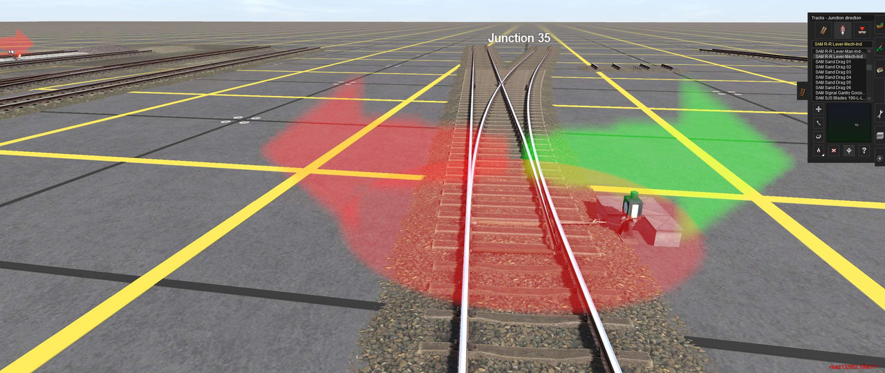
Now if only there was an easy way to turn of those garish looking red circle and arrows in Surveyor.:(
 
Setting the size of the various overlay items can be done through the shader code. it would be nice if they gave us an option for this so that you don't have to modify them and break patching.

I prefer something around this size

NS_37_5babadd4a15a8.PNG
 
Of all the changes introduced in TRS19, most of them significant improvements on previous versions, I think that the 'Zombie drivers control panel' is by far the worst for several reasons.

1: It takes up a huge amount of screen space compared with other controls and compared with the previous implementation. Management of screen 'real estate' is vry important when operating the control system.
2: The images of the so-called drivers are well described as 'Zombies', and are much less interesting than the images provided previously. No useful purpose is served by having the images so large. The relationship between the face and the 'name' which appears under it has been broken and is purely arbitrary, and no doubt disappointing to those many people who supplied their images as drivers.
Personally I replace the driver names when I produce the driver schedules in Surveyor, with loco or train descriptors when I create a session - much more useful than the individual loco model instance descriptor, but there is now not enough space to display this and now mouseover functionality to display it in full.
3: The loco image is unnecessarily large as it only indicates general type rather than a unique vehicle in the session.
4: There is not enough space for the full description of the locomotive to be displayed - if there are several of the same type, the full name needs to be displayed as the distinguishing information is the last character: 1, 2, 3 etc.. The full Loco description should display on mouseover.
5. The same comment applies to the description of the schedule command which the loco is currently performing. The previous practice of displaying the Driver Command icon was more intuitive and the full description was displayed on mouseover.
6: The descriptions of the effect of the five 'button' icons is not clear:
- What happens when the driver is removed from the session? Does her/his train simply stop or disappear?
- What happens if the driver 'Gets off the train'?
- What is the functional difference between 'Move to Destination (eg. Locomotive)' and 'Focus on Driver'? The seem to do the same thing.

The size of this control panel in previous versions of Trainz and its unambiguous and helpful mouseover functionality were very effective. Perhaps an implementation similar to the previous version but with a fly-out panel on mouseover to display any additional information would be a much better implementation, but the descriptors of additional functionality need to be clear.
 
There are more problems. The icons on the lower right are displayed on whatever background the current route presents. They are hard to see, and too small. (yes, there is some adjustment available, but the icons should have their own background)

Also, the Edit Trains has a check mark, so if it is checked, the fly-out tag should stay enabled until the user unchecks Edit Trains.
 
Hi,

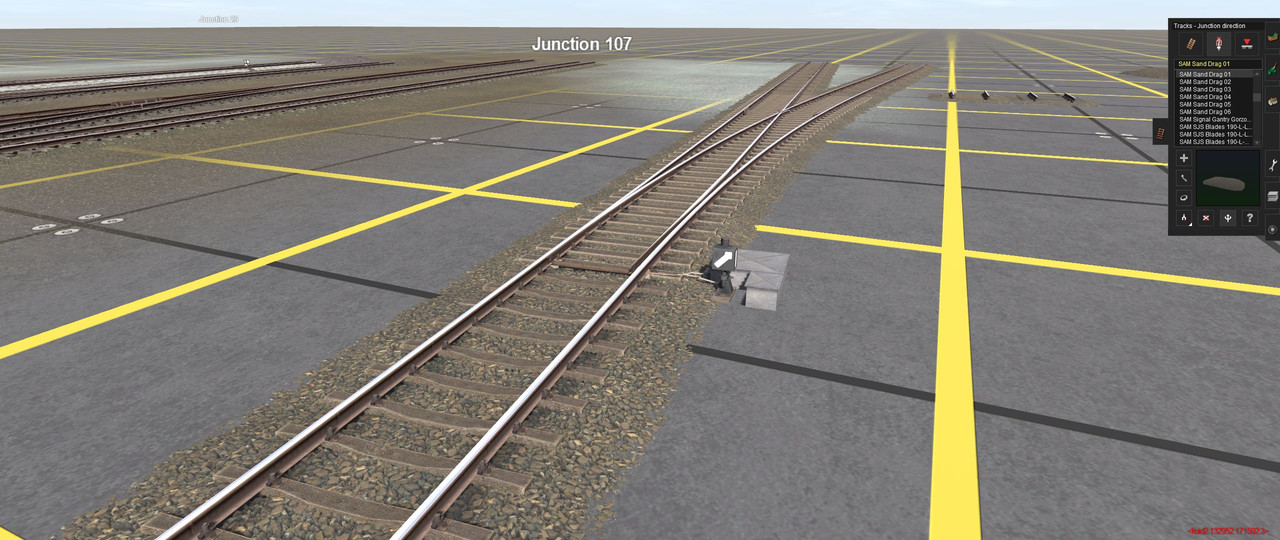
Is it possible to make those ugly green-red arrows to relatively smaller (or invisible when you are, say in driver no hud mode) when you are close to a lever? Nowadays, in the times of detailed graphics you would like to observe an animated lever indicator working but it is almost impossible due to the fact the arrows are on the whole screen (and the animation starts right after your sets the junction so there is no time to move your mouse somewhere else). Sometimes it is almost impossible to do a good close-up screenshot because you have to run your mouse pointer to an edge of the screen not to see the arrows. I know my screenshot is in the surveyor mode but it is the same in driver. And when working with procedural tracks having arrows is pointless (you see how a junction is set with the junction blades). There could be a tag to set the arrows on/off in the apropriate lever asset config.


Who agrees with me?

I agree with you!!!
 
Back
Top